After reviewing CSS systematically,I've found some interesting CSS topics deserved to be wrote down:
- Using only percentage to draw a square
- Specificity-1000 100 10 1
- Properties Inheritable or Not
- Margin collapsing
- Align self
- Box sizing
- Auto
Using only percentage to draw a square
Drawing a square by pixel is nothing hard, but have you tried using percentage to draw a square? As you know, browser's default width and height are not same, so using width: 10%; height: 10%; cannot draw a square definitely. You can get the answer only if you have mastered enough CSS basis:
The size of the
marginandpaddingas a percentage, relative to the width of the containing block.
It amazed me when I found this rule first. Why there's only width? Where's height? Strange but interesting thing. So, there're one more answers:
width: 0; height: 0; padding: 5%;width: 10%; height: 0; padding: 5% 0;
Specificity
CSS(Cascading Style Sheets) determines the style of dom, and the specificity of a selector determines whether its style,instead of other selectors' styles, can be attached on dom. Specificities of different selectors are listed on following table.
Selector | Specificity ---|--- style attribute of a html tag | Thousand(1000) Id | Hundread(100) Class | Ten(10) Dom element or pseudo-element | one(1)
You can find specifities' numbers from top to bottom are: 1000, 100, 10, 10. This number sequence is really easy enough to be remembered. And selectors' order, as commonly used in daily development, can be accepted by us naturally.
Therefore, it's convenient if you'd like to calcuate a selector's specifiy, just use the formula: m * 1000 + n * 100 + p * 10 + q * 1
Properties Inheritable or Not
Someone who has written countless rows of CSS codes must have found that CSS properties: color and font-size can be inherited but width and height cannot. Why? Maybe writing repeating proproties does make no sense. Thank people on stackoverflow, you can find all CSS properties inheritatble or not on this list.
Margin(Top and Bottom) collapsing
Margin collapsing, only for top and bottom margins, is a strange behavior that margins of blocks are collapsed(combined). There's my another article talking about margin collpasing specifically.
And normally, collapsed margin's size is the largest of margins being collapsed.
Align self
If you are familiar with flex, you must often set align-items: center; on flexbox container to align chilren vertical items center. However, how about setting properties directly on children items to align themselves? Property align-self can help it.
Box-sizing
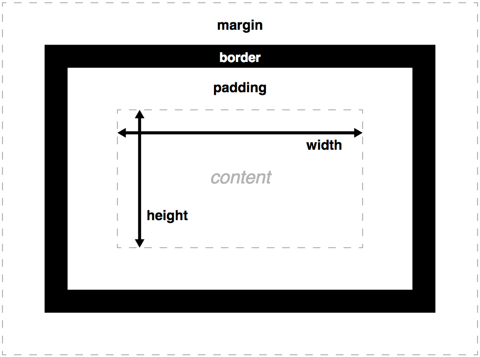
Once upon a time, I was someone who didn't know this property and who had been struggling for some basis CSS layouts. Main difference between two types is whether width and height have fixed values.content-box is default type, which means width and height are fixed and padding, border, margin are outside of content.

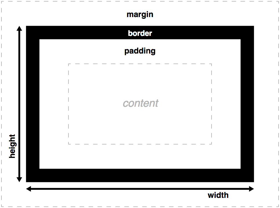
Likewise, border-box means width and height are not fixed, being expanded by inner padding and border with margin still outside.

Auto
CSS property value auto would justify some elements properties automatically.Two commonly used situations are:
1. margin: 0 auto; for blocks
For blocks, centering content can be convenient by setting margin: 0 auto.
2. margin-left: auto; for flex items
There's no justify-self like align-self for flex container(but grid had) so far. But you could make it by using margin together with auto.
Summary
CSS is interesting indeed. Without CSS it would drive lots of front-end developers crazy if they would spend long time to write complex styles like what we have to do for setting the style of canvas now. So far I have just found several interseting things about CSS above, so I would add new things interesting to this article at following time.
感谢你的阅读。欢迎通过微信(扫描下方二维码)或Github订阅我的博客。
